Avatar
Basic Avatar
Preview
Usage
import { Avatar } from 'archi-ui'<Avatar />Image Avatars
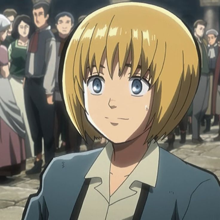
Image avatars can be created by passing standard img prop src to the component.
Preview


Letter Avatars
Avatars containing simple characters can be created by passing a string as children
Preview
Variant
If you need square, rounded or circular avatars, use the variant prop.
Preview
Size
Use size prop to change the size of the Avatar.
Preview


Icon avatars
Icon avatars can be created by passing an icon as children.
Preview
Avatar Fallback
If there is an error loading the avatar image, the component falls back to an alternative in the following order:
- The provided children
- the first letter of the alt text
- a generic avatar icon -
<User />
Preview


Avatar Group
AvatarGroup renders its children as a stack. USe the max prop to limit the number of avatars.
Preview


Avatar Group control
You can controll the avatars shape, size, and outline from AvatarGroup component itself using variant, size, and outlined prop of AvatarGroup.
Preview




Total Avatars
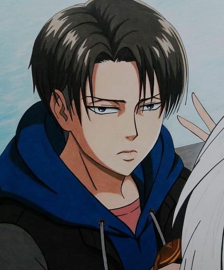
If you need to control the total number of avatars not shown, you can use the total prop.
Preview


Custom surplus
Set the renderSurplus prop as a callback to customize the surplus avatar. The callback will receive the surplus number as an argument based on the children and the max prop, and should return a React.ReactNode.
The renderSurplus prop is useful when you need to render the surplus based on the data sent from the server.
Preview


Spacing
You can change the spacing between avatars using spacing prop. You can use one of the presets (‘lg’, ‘md’, ‘sm’).
Preview


Avatar with badge
Preview


Avatar API
API reference docs for the React Avatar component.
Props
| Name | Type | Default | Description |
|---|---|---|---|
| children | node | - | Used to render icon or text elements inside the Avatar if src is not set. This can be an element, or just a string. |
| className | string | - | Override or extend the styles applied to the component |
| alt | string | - | Used to provide an alt attribute for the rendered img element. |
| variant | 'circular' | 'square' | 'rounded' | 'circular' | The shape of the avatar. |
| size | 'lg' | 'md' | 'sm' | 'md' | The size of the avatar. |
| outlined | bool | false | If true, the outline will be applied. |
| src | string | - | The src attribute for the img element. |
| imgProps | object | - | Attributes applied to the img element if the component is used to display an image. it can be used to listen for loading error event. |
AvatarGroup API
API reference docs for the React AvatarGroup component.
Props
| Name | Type | Default | Description |
|---|---|---|---|
| children | node | - | The avatars to stack. |
| className | string | - | Override or extend the styles applied to the component |
| max | number | 5 | Max avatars to show before +x. |
| total | number | children.length | The total number of avatars. Used for calculating the number of extra avatars. |
| renderSurplus | func | - | custom renderer of extraAvatars Signature: function(surplus: number) => React.ReactNodesurplus: number of extra avatars Returns: custom element to display. |
| spacing | 'lg' | 'md' | 'sm' | md | Spacing between avatars. |
| variant | 'circular' | 'square' | 'rounded' | - | The shape of the all avatars. |
| size | 'lg' | 'md' | 'sm' | - | The size of the all the avatars. |
| outlined | bool | true | If true, the outline will be applied to all the avatars. |