Skeleton
Display a placeholder preview of your content before the data gets loaded to reduce load-time frustration.
The data for your components might not be immediately available. You can improve the perceived responsiveness of the page by using skeletons. It feels like things are happening immediately, then the information is incrementally displayed on the screen.
Basic Skeleton
Preview
Usage
The component is designed to be used directly in your components. For instance:
import { Skeleton } from 'archi-ui'{item ? (
<img alt={item.title} src={item.src} className='w-54 h-64' />
) : (
<Skeleton variant='rectangular' className='w-54 h-64' />
)
}Variants
The component suppots 4 shape variants:
— text(default): represents a single line of text (you can adjust the height and width via className).
— circular, rectangular, rounded: come with different boder radius to let you take control of the size.
Preview
Animation
By default, the skeleton pulsates, but you can change the animation to a wave or disable it by pass value as none.
Preview
Pulsate Example
Preview

Don Diablo @ Tomorrowland Main Stage 2019 | Official…
Don Diablo396k views • a week ago
Queen - Greatest Hits
Queen Official40M views • 3 years agoCalvin Harris, Sam Smith - Promises (Official Video)
Calvin Harris130M views • 10 months agoWave Example
Preview

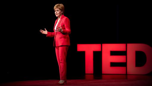
Why First Minister of Scotland Nicola Sturgeon thinks GDP is the wrong measure of a country's success:
Skeleton API
API reference docs for the React Skeleton component.
Props
| Name | Type | Default | Description |
|---|---|---|---|
| className | string | - | Override or extend the styles applied to the component |
| animation | 'pulse' | 'wave' | 'none' | 'pulse' | The animation. If false the animation effect is disabled. |
| variant | 'circular' | 'rectangular' | 'rounded' | 'text' | 'text' | The type of content that will be rendered. |